Creating a peaceful and relaxing home environment starts with choosing the right colors. Calm, soothing hues can transform any space into a tranquil retreat where you can unwind and recharge. Whether you’re redecorating a single room or your entire home, selecting calm colors helps set a serene mood that promotes comfort and well-being. In this post, we’ll explore helpful tips for choosing calm colors and how to use them effectively in your home.
Why Choose Calm Colors?
Colors have a significant influence on mood and atmosphere. Bright or intense shades can energize or overwhelm, while calm colors invite relaxation. These hues tend to have soft, muted undertones that are easy on the eyes and reduce sensory noise. Incorporating calm colors can:
– Lower stress levels
– Improve focus
– Promote restful sleep
– Create a warm, welcoming space
Knowing the emotional effects of various colors can guide your choices to create the ideal ambiance for your home.
Popular Calm Colors for the Home
Before diving into tips, here are some widely appreciated calm colors to consider:
– Soft Blues: Evoke a sense of serenity, reminding us of clear skies and calm seas.
– Gentle Greens: Bring the freshness of nature indoors, fostering balance and renewal.
– Warm Neutrals: Beige, taupe, and cream offer cozy, understated backdrops.
– Muted Lavenders: Provide a subtle touch of softness and elegance.
– Pale Grays: Modern and versatile, they offer a cool, soothing foundation without feeling cold.
Experimenting with these colors or mixes of them can help you achieve the calm atmosphere you desire.
Tips for Choosing Calm Colors
1. Consider the Room’s Purpose
Start by thinking about how you use the room. For example:
– Bedrooms benefit from restful colors like soft blues or muted greens.
– Living areas can have warmer calm shades like beige or gentle taupe to encourage relaxation and conversation.
– Home offices might use pale grays or soft greens to help maintain focus without feeling sterile.
Matching colors to the function of the room ensures the atmosphere supports your intent.
2. Use Natural Light as a Guide
Lighting dramatically affects how colors appear. Examine your rooms at different times:
– South-facing rooms get plenty of sunlight and can handle cooler calm colors well.
– North-facing rooms, often cooler in tone, may need warmer calm shades to counteract shadowy light.
– East and west-facing rooms receive changing light throughout the day, so test colors in morning and evening light.
Bring paint samples home and observe them in the natural lighting to avoid surprises.
3. Choose a Color Palette, Not Just One Color
Selecting a palette with a dominant calm color plus complementary shades creates depth and interest while maintaining tranquility.
– Use a primary calm color for walls.
– Add slightly lighter or darker shades for trim, furniture, or accent walls.
– Incorporate soft textures and materials in similar hues for cohesion.
This layering creates subtle variation without disrupting the peaceful vibe.
4. Opt for Matte or Satin Finishes
Paint finish affects light reflection and mood. Matte or satin finishes absorb light softly, reducing glare and enhancing the calming quality of colors. Avoid very glossy finishes that can feel too bright or distracting in a calm setting.
5. Test Colors with Samples and Swatches
Don’t pick colors based solely on chips or photos. Paint large swatches on your walls to see how calm colors look with your furniture and lighting throughout the day.
6. Limit Bold Accents
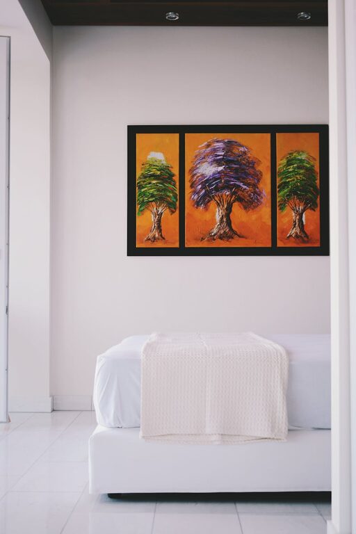
While calm colors dominate, adding small pops of color can energize a room without disrupting the peaceful tone. Choose accessories like pillows, artwork, or vases in muted versions of your accent color.
7. Incorporate Nature-Inspired Elements
Pair calm colors with natural wood, stone, plants, or other organic elements. These textures and materials complement soothing palettes and enhance the feeling of tranquility.
How to Apply Calm Colors Room by Room
Living Room
Use warm neutrals or soft blues as your base. Add plush cushions or throws in complementary shades to make the space feel inviting.
Bedroom
Soft blues or gentle greens create a restful atmosphere. Keep bedding, curtains, and rugs in coordinating calm colors to create a cozy retreat.
Kitchen
Opt for muted greens or pale taupes to keep the kitchen bright but calming. Cabinets in soft tones pair well with natural wood accents.
Bathroom
Consider pale grays or lavender for a spa-like feel. Use white or light-colored fixtures to maintain a clean, airy environment.
Final Thoughts
Choosing calm colors for your home is a wonderful way to foster relaxation and well-being. By considering room function, lighting, finish, and a harmonious palette, you can create spaces that feel peaceful and welcoming. Remember to test colors thoroughly and pair them with natural materials for the best results. With these tips, you’ll enjoy a home filled with calm and comfort every day.